
Originally published at Netscape Enterprise Developer, now archived at the Wayback Machine
Prior to the release of Netscape Navigator 4.0 and Microsoft Internet Explorer 4.0, Web developers had to use a lot of tricks to control the layout and looks of a Web page. There was no easy way to control the positioning of elements on the page — the two photos that lined up perfectly over the text on your browser when you laid out your page could be completely askew when someone else downloaded them.
To counteract this non-standard display problem, Web authors tended to develop an arsenal of “tricks” that made layout easier. Among the more common tricks were the use of HTML tables to control page layout and a one-pixel transparent GIF to control the placement of content within a line or within a page.
With the newer 4.0 browsers, however, site developers have new, fewer roundabout techniques to control element placement and page layout. For instance, the Cascading Style Sheet Positioning (CSS-P) specification (now incorporated into the CSS2 working effort) and the original CSS1 specification add layout capabilities to HTML development. (See the page listed in our Resources section below for detailed Cascading Style Sheet information.) In addition, the rise of dynamic HTML technology means that authors not only have control of the static placement of HTML elements on a page, they can also move elements and hide or show them after a page is displayed.
Even with these new techniques, however, I find myself using old standbys — specifically, HTML tables and the one-pixel transparent GIF — but now I’m using them in combination with the new technologies to create interesting and useful effects. You too can combine the best of the old and new for more control over your page layout.
The one-pixel transparent GIF
Prior to the release of Navigator 4.0 and IE 4.0 and the development of the Cascading Style Sheet Positioning spec, Web page authors were severely limited in how much we could control the placement of Web page elements. One element that you could use to provide some placement control was the image element, defined with the <IMG> tag. Using the image element, an author could specify a vspace or hspace (vertical or horizontal spacing) value, as well as a vertical or horizontal alignment (right or left, top or bottom).
In addition to the image element, some older browsers supported the use of the transparent GIF. Using a transparent GIF, the specific color you identify within the image is transparent when loaded into a browser.
David Seigal of Killer Web Site fame combined the two ideas and came up with the image element that happened to be a small one-pixel transparent GIF. Since it’s tiny and transparent, it can be easily added to a layout without disrupting the underlying content; by using the specific spacing value capability of the image element on the one-pixel transparent GIF, you could add white space or position content in a specific location.
Beginning with Navigator 4.0 and followed by Internet Explorer 4.0, however, Web authors began using CSS-P for specific element positioning and CSS1 for adding margins or padding to a page (or even within an element). There was no longer a need for the little one-pixel transparent GIF. But an odd thing happened when I was about ready to delete my trusty little GIF file: I actually found a new use for it.
I wanted to create a page for my Dynamic Earth Web site that showed several different minerals and included a moveable “frame” that positioned itself over each image based on some event. When the frame was over the image, the image was activated — if the user clicked on it, information about the mineral would appear. Of course I knew I could use CSS1 to create a frame around content, then use CSS-P to move the frame, but I wanted the interior of the frame to be transparent.
The solution I came up with was to create the frame using a one-pixel transparent GIF for the interior, setting its width and height to be the exact size of the frame I wanted. Using CSS-P, I could then move this GIF around from image to image. I also created two separate layers for each image: one that had the original image, which didn’t do anything when the reader clicked it, and another that had a framed, transparent GIF, which showed the mineral information layer when clicked. Figure 1 shows a snapshot of this page:
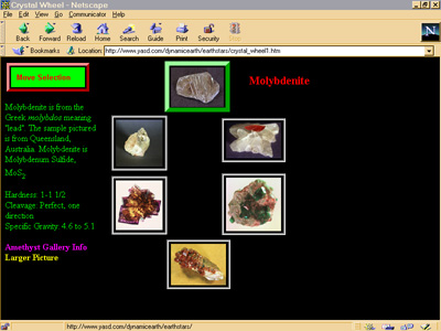 Figure 1 |
The one-pixel transparent GIF turned out to be much more than a simple placement and whitespace tool; it’s a handy tool that can be stretched and shrunk as needed and reused as often as necessary.
Positioning a menu for both old browsers and new
I soon found other uses for my newly rediscovered little GIF file, including a solution for a new Web page authoring problem I encountered.
I used to have a menu along the top of my pages that contained four separate images and text-based links just below the images. I used an HTML table to control the placement of images and text, ensuring that the images were placed directly next to each other and were aligned along the top of the page. One thing I never liked about this approach was that I preferred that menu text be layered over the images rather than displayed below them.
With CSS-P, I could position the images at the top of the page and use absolute positioning to place the menu text over the images. The problem I encountered, though, is that the page didn’t look very good when viewed with a pre-Navigator or IE 4.0 browser.
Instead, I used an HTML table along the top of the page, including the four images and their associated text in the table cells. However, I included these images and text in blocks delimited by <DIV> tags (these allow formatting to span multiple elements) and then used CSS-P to position the images and text so they overlapped. With this approach, older browsers see the page as they always have, as shown in Figure 2, but in the newer browsers the page has the new overlapped look, as shown in Figure 3.
Figure 2 |
 Figure 3 |
There was one last problem with this approach, though. The thing with absolute positioning is that if you have it on content within a table element, the contents do not influence the table row’s height or the table cell’s width. This means that any other content on the page gets placed after the table, but overlaps the images and text because the table is not sized correctly.
I found that a simple solution for this was to use my trusty one-pixel transparent GIF as the first table cell and set it to the height I wanted the table to occupy. This sized the entire row to the height I needed to cover the positioned content — once again, a successful blend of the old and new.