I have a post coming later on a lovely walk I had yesterday. With photos, of course.
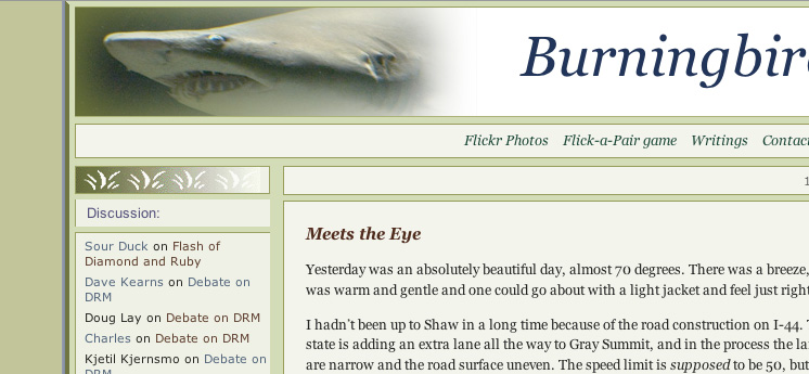
In the meantime, I think I’ve made my last, my absolute last, tweak of the design for Burningbird. I’ve lightened the blockquote colors, and added a graphic at the end of the content column in the main page. I’ve removed the “Linked in” listing at the end of the post, as some aggregators think if a link is given twice in the same posting, it’s a spam, so I won’t repeat the link.
I’m also not going to be repeating photos in the main page, but only in the entry page. With this, I can use larger photos, and keep the main page from being too slow to load.
I have two other designs to complete on my site: one for my main burningbird.net, which will point to example code, tutorials, writings, work history, client sites, and the other things we like to brag on; and one for the experimental tech server and the newly re-designed and re-focused Tinfoil Project. The former will be based on ‘fire and ice’ after my new hand crafted marble picked up in Idaho; the latter will be in shades of dead leaf rusts and beiges, silver, pewter, and brushed aluminum. The Tinfoil Project site will also have a rather unusual organization.
But Burningbird the weblog is fully cooked and only wants some minor cleanup and accessibility tweaks, and a quick look in different browsers in different operating systems to make sure that I didn’t break anything. Huzzah. It only took me five years to get to this point.
update
I do have fun with the photos for my header, but I’m forced to admit that this is one of my favorites.

