My previous weblog theme featured a very large photo as header, taking up the entire page before you would get to the writing. When I got a 4k monitor, the graphic didn’t upgrade that well, which made me realize how having a graphic play such a prominent role just wasn’t going to work.
(It hasn’t helped that Google constantly nagged me about problems with the design.)
Time for a new theme. And if I’m going for a new theme, I’m going as minimal as I can, and here we are. This WordPress 2020 theme is very basic, but the focus is where it should be: on the writing. It’s plain, just like me.
Since I made a break with the past in the theme, I decided it was also time to start using WordPress’s new block editor, Gutenberg. The editor is definitely a major change, but workable. I especially like its ability to incorporate images that work with the text regardless of how you view the page.

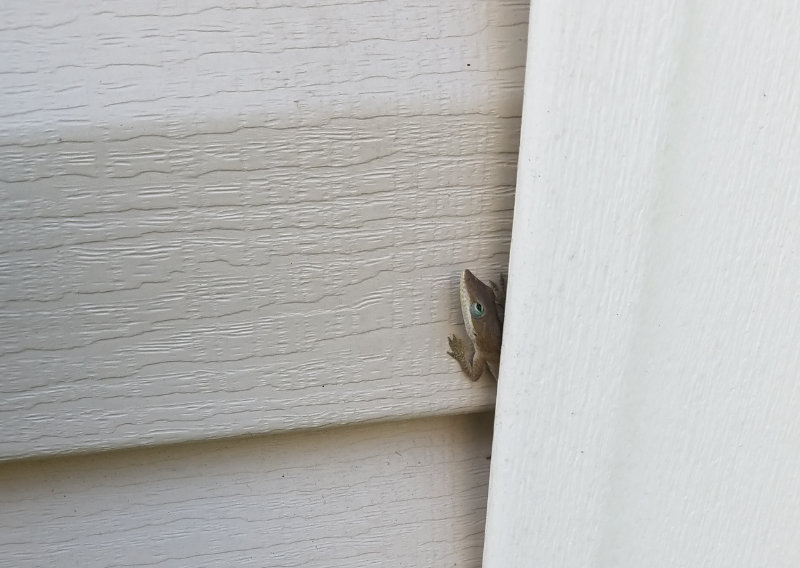
New city. New state. New little neighbor. New weblog look. New weblog editor.
Same old me.
