Categories
Technology

Tech: A Welcome Respite

It’s long past time for me to return to technical writing, if only because I need a respite from the battle against Trump and his evil minions.

It helps that there is a lot to be excited about—in a good way—in the tech world. The Node community seems to be moving beyond its early growing pains and is starting to stabilize. There’s still occasional drama, but not enough to make you scream in horror and run away.

My beloved SVG is really coming into its own with widespread support. I’ve been waiting years for this. There are great libraries to make it easier to build applications, but for me, the holdup has always been browser support. Now, I can party.

CSS! Can you believe what you can do with CSS now?  Not to mention that the W3C has really its act together when it comes to documenting what’s happening with specs.

Speaking of specs…HTML is no longer held hostage by a tin-plated dictator.  I’m sorry, did I say that out loud? I did notice that the working group mailing list is extremely quiet nowadays. This is because all the action has moved to GitHub. Probably more efficient. Not as fun.

Excellent news about the W3C and IDPF merging their efforts.

The vision to align Publishing and Web technologies and create a new roadmap for the future of publishing became official today with the announcement that the World Wide Web Consortium (W3C) and the International Digital Publishing Forum (IDPF) have combined organizations.


Categories
Technology

Embedded fonts with font-face

I’m experimenting with my first attempt at using embedded fonts here at RealTech. I’m using the Gentium Basic TrueType font, which I downloaded from Font Squirrel. Since Internet Explorer doesn’t support truetype fonts, I had to use the ttf2eot application to convert the truetype into EOT, which is what Microsoft supports. Edward O’Connor has a nice writeup in how to use ttf2eot. I downloaded my copy of the utility, since I couldn’t get the Macports version to install. You can also use Microsoft’s WEFT utility on Windows.

(update There is also a Gentium Basic font-face kit that contains everything you need, including EOT files and a stylesheet.)

Once I had both versions of all the font files uploaded to my server, I added the CSS for the font-face rules. You can add these rules as a separate file, or include them in your stylesheet, whatever rings your bell:

/* For IE */

@font-face {
        font-family: 'Gentium Basic';
        src: url('GenBasR.eot');
}

/* For Other Browsers */

@font-face {
        font-family: 'Gentium Basic';
        src: local('Gentium Basic Regular'),
             local('GentiumBasic-Regular'),
             url('GenBasR.ttf') format('truetype');
}

@font-face {
        font-family: 'Gentium Basic';
        src: local('Gentium Basic Italic'),
             local('GentiumBasic-Italic'),
             url('GenBasI.ttf') format('truetype');
        font-style: italic;
}

@font-face {
        font-family: 'Gentium Basic';
        src: local('Gentium Basic Bold'),
             local('GentiumBasic-Bold'),
             url('GenBasB.ttf') format('truetype');
        font-weight: bold;
}

@font-face {
        font-family: 'Gentium Basic';
        src: local('Gentium Basic Bold Italic'),
             local('GentiumBasic-BoldItalic'),
             url('GenBasBI.ttf') format('truetype');
        font-weight: bold;
        font-style: italic;
}

Notice that there are separate files for bold and italic fonts, as well as the ‘normal’ font. All are included, and all are given the same font-face alias, in this case “Gentium Basic”. It’s up to the user agent to determine which font to use in which circumstance (normal weight versus bold, normal text versus italics), Once the fonts are defined, they’re used wherever you would use standard fonts:

#rap {
  width:960px;
  margin: 0 auto;
  position: relative;
  z-index: 2;
  background-color: #fff;
  color: #444;
  font: 0.9em/1.5em "Gentium Basic", Georgia,serif;
  font-style: normal;
}

I provide fallback fonts, for browsers that don’t support font-face.

So, how are these font rules working in various browsers?

Browsers that don’t support font-face yet, such as Opera 9.64, pick the fallback web safe font, as they should.

Safari 4 supports font-face, though the page can show up oddly until the fonts are downloaded to the person’s machine. If you’ve accessed a web site and no text shows, but underlines are appearing for the links, chances are the person is using font-face. The “blank” text doesn’t last long, though, depending on how fast your connection is, and how fast the web server serves up the font.

Once the font is loaded, Safari uses the fonts as described in the CSS3 specification.

Firefox has support for font-face beginning with 3.5. It doesn’t have the download hiccup that Safari seems to have, because it uses the default web font until the font is downloaded, and then redraws the text. (From what I can see, other browsers such as Opera 10.0 beta 2 do the same.)

Using Browsershots and my own PC, I’ve found that Internet Explorer also makes use of the fonts, in the EOT format I’ve provided. However, it doesn’t support the font style and weight specification.

Chrome is using WebKit, which would lead one to think that it supports font-face, but I’ve not seen webfonts work with Chrome. Again, just because Chrome is using the WebKit engine, doesn’t mean the Chromium graphics engine (Chrome’s own graphics engine) supports the same functionality that Safari or WebKit’s graphics engine have.

Opera 10.0 has been a problem for me. All of the fonts are showing as italic in Opera 10 beta 2. I don’t think there’s a problem with my CSS, and have since filed a bug with Opera. When the fonts are installed on the desktop, then Opera 10.0 seems to work. If not, you get italics.

update Thanks to Philippe, I’ve updated the stylesheet. IE does not support the font weight and style setting, so you only specify the one EOT file, for the basic font. In addition, the local setting in the stylesheet provides a local file name for the font, for the browser to use rather than have to download the font. Opera 10 does work when the file is local, but not when downloaded.

Also thanks to Baldur, whose use of Gentium Basic inspired me to try it at my site.

Update

Bruce Lawson added a comment that Opera is aware of the problem, and working on a solution.

I received an email from Stefan Hausmann,who wrote:

@font-face has been disabled in Chrome [1] because of “security concerns”. They announced webfonts support months ago, then disabled them by default, but failed to communicate that to the general public. They’re working on reenabling them by default [2].

In the meantime, you can use the –enable-remote-fonts command line switch. It’s still buggy on Chromium 4.0.202.0 where I tested it. Sometimes web fonts don’t render at all, sometimes single words don’t render (as if they were transparent) or only when selected. Sometimes selecting text with web fonts crashes the browser.

[1] http://code.google.com/p/chromium/issues/detail?id=9633 [2] http://code.google.com/p/chromium/issues/detail?id=17818

Categories
Technology

Air Minimalism

I’ve noticed a growing trend towards more organic web designs, lately. We see fewer sites with rounded corner header graphics, plastic colors, and infinite reflections, and more with images seemingly plastered across the page, and then allowed to weather and age until looking like the wall paper in our Aunt Sally’s fusty old apartment. I like the new looks, if only because they add to the seemingly infinite variety of web design possibilities.

However, there’s a new movement afoot to eliminate many of the old web design paradigms. To strip away the wallpaper and 2.0 reflections, equally. The movement is towards a minimalist design.

This weekend, Russell Beattie writes about the new minimalist designs, pointing to the recent redesigns by Mark Pilgrim, James Bennett, and Ryan Tomayko. Three web developers/designers, three sites, but all three share a common design focus: minimal page layout, with minimal visual cues, as well as minimal color. The operative word is minimal.

The approaches

Tomayko’s approach to minimalist design was to reduce what he calls administrative debris at his site, including adding in-page editing rather than using an administrative interface. Archive references are built into the header, and he restores the hypertext link back to its initial position of importance. As he writes, the elegant simplicity of the link is subverted all too often, in favor of gimmicks to make the web page look more like the desktop.

Since the web’s inception and subsequent boom, people have been trying to get around hypertext’s “limitations” as an interface medium: first with Java Applets and Active X controls, later with Flash sites, and today with Rich Internet Application (RIA) platforms. There was a time when sites were authored with the goal of preventing the vertical scroll-bar from ever appearing! The goal is always the same: invert the web’s superior content-oriented interface back to the GUI era and allow for the types of administrative debris so common and accepted in desktop applications.

Tomayko has an excellent point, yet is a minimalistic web page inherently a single column, black and white page, sans graphics?

Administrative Debris
Uploaded with plasq‘s Skitch!

Bennett’s take on Tomayko’s work is on emphasizing the content by reducing everything else to the barest minimum necessary. This reductionism includes removing what are normally seen as “essential” elements of a site’s design.

The big take-away from Ryan’s redesign, for me, was a much stronger focus on content, and a de-emphasizing or removal of anything that wasn’t content. This meant a lot of traditional design elements, such as a header/logo, sidebars, etc. immediately went out the window in favor of a simple, single-column layout. There’s no logo, no header and no sidebar. A paragraph’s worth of metadata which used to be present in the sidebar of every page has disappeared, replaced with a much smaller interstitial line of metadata which now (in the absence of dedicated elements in the page for this purpose) does double duty as an aid to navigation.

In his minimalist design, Bennett reduced his site to single column, black and white, with meta information contained in a subheading under each article’s title. He also uses HTML rather than XHTML, as I recently discussed, but that’s incidental to the design. Or is it?

Minimal
Uploaded with plasq‘s Skitch!

Pilgrim reflects the philosophy of both Tomayko and Bennett in wanting to strip as much as the “administrative debris” from the page, focusing, again, on a single column with archival and meta data incorporated into the writings rather than in headers, footers, or sidebars. He, like Bennett, also references the excellent online publication, The Elements of Typographic Style Applied to the Web. I’m not surprised a minimalistic web design would require paying an increased attention to the typography, as the approach strips out every other last visual element of the page, and the only visual element left to tweak is the text.

Pilgrim also references the A List Apart article on grid-based page layout, an approach to page design that has gained considerable popularity, and which probably directly or indirectly also inspired Tomayko and Bennett. Pilgrim also relies more heavily on the browser “chrome” to fill in for some of the functionality in the page, such as navigation bars for multiple page documents. However, not all browsers support such cues: does minimalism require a return to the days of “This site best viewed with…”?

Minimalism [dive into mark]
Uploaded with plasq‘s Skitch!

Is this the start of a new trend? A move away from the currently cluttered web spaces, with their Ajax-based intros and navigation, not to mention tools and widgets? A minimal page design certainly helps the web page load faster, and makes it easier to spot the content. It also eliminates many of the problems associated with differences among browsers, not to mention whether the page is viewed via mobile device or on the big screen at home.

Recently, the St. Louis Today web site underwent a redesign the charitable could only refer to as not minimalism. The navigation is hard to find because there’s so many conflicting navigation cues—when the navigation isn’t being covered by ads that unfold and hide half the page contents. The site loads slowly, has clashing animations, and generally makes it difficult to determine what is the main story. Seeing a site such as St. Louis Today, one wants to celebrate a return to simpler times, of black and white pages, easily read.

I also like the reliance on webiness in a minimalistic environment when it comes to navigation and page layout. There is no popping, dropping, or flashing. The page starts at the top and unrolls to the bottom. You only scroll vertically, other than viewing the site on a very small monitor. This design is the original web page—the essence of web page, if you will.

The minimal web site design is also a good springboard design technique for those of us who are web design challenged. A simple column rather than fuss and fuss on a web design for weeks only to have it fall flat. For instance, I fussed over the initial web design for this site for weeks, only to have it greeted with silence when I showed it to some folks. Disappointed by lack of accolade, I ripped the design out, quickly putting together a variation of Drupal Garland’s theme, except incorporating the Painting the Web book colors and cover image. The first design took weeks, the second, hours. Oddly enough, I now prefer the latter design because it seems more supportive of both the book and the material than the original. (You can see both for yourself: I’ve added a theme switcher into the sidebar.)

Not only can a minimal web site design eliminate the “administrative debris” while focusing attention on the content, it can also eliminate the hours we spend tweaking our site designs; hours that could be used to actually create the content.

However, my new design is not a minimalist design. On the other hand, my personal web site, Just Shelley is a “minimal” design if we consider a design that strips out the sidebar entries and minimizes the administrative debris. Well, other than I do have next and previous link navigation at the bottom of the pages, a small header bar, and don’t make use of categories at the site. I use graphics, but a minimal site shouldn’t be dependent on being only black and white and without any graphics if the point of the effect is to focus attention on the main content block rather than peripherals. Or is that the point? Though not explicitly stated, the minimalist designs shown reflect the same basic design: single column, black and white, and no graphics.

What is minimalism

I found the efforts of all three gentlemen to be intriguing and very elegant in their zen-like simplicity. It seemed, though, that there were three different components of web design incorporated into one definition of minimalism, which might have benefited from being separated out into different discussions.

From my reading, the first and most critical component of the minimal design is to eliminate the unnecessary—the “administrative debris”, as defined by Tomakyo. This reduction also means that we eliminate some of the visual cues we’ve come to associated with weblogs or other personal sites: removing the feed icon and putting the dependence on the browser and autodiscovery; removing the obvious next and previous links and depending on the rel attributes; eliminating headers and footers and incorporating links to this information within the writings themselves; relying on generalized search rather than individual site search engines. Tomakyo even takes the reduction to a further step by incorporating editing features directly into the main view page, and eliminating a separate administrative interface.

The result is remarkably sparse and efficient, but not without its detractors. Beattie, for one, had a problem with this form of minimalism.

you have to think like a reader of your blog. They want to know where they are, and what they are supposed to read, and if they like the content, where to find more. A common use case is the person that arrives from a web search: They find the post, and immediately see that the page is part of a person’s weblog, written on a specific date. If they want more information about the author, the “About Me” is big and obvious. If they want to see what else I’ve written, they can click on the Archives link, or the Search link for more info. I can see the click stream for this blog using Google Analytics that this is pretty much how most searchers use the site. Almost always the next click after the first page is to the About Me page, and then to the Search or Archives.

Beattie’s comments remind me of my reaction to the new Mac Air from Apple, the laptop that Apple bills as Ultra thin. Ultra portable. It is incredibly thin, and very light. Some have even called the machine sexy. What was sacrificed in the machine, though, in order to achieve these goals?

The Mac Air has no built-in CD or DVD player, the hard drive is small, the CPU minimal by today’s standards, and it has only one USB 2.0 port…in other words, Apple has created the ideal iTunes machine. Frankly, I’d rather add a pound and an inch and get back the player, and more disk space— not to mention increase both CPU and RAM so that I can actually use my more CPU intensive applications, like Photoshop. I don’t need a computer that fits in a manila envelope and have never found my four year old Powerbook to be an onerous burden when traveling.

To me, the Mac Air is less a machine filling a necessary niche, than an offering to Steve Jobs’ obsession with engineering ingenuity and cramming increasingly larger amounts of functionality into increasingly smaller spaces. When I saw it, my first thought was not, “Oh, that would be useful”.

In some ways, the same can be said of minimalistic design: ultra thin, ultra light, perhaps even sexy, but is is usable?

Earlier I mentioned about Bennett’s take on HTML as compared to XHTML and how this doesn’t impact on page design. The reality is that markup choices can impact on page design. If you serve pages up as XHTML you can incorporate SVG (not to mention MathML) into your web pages, and into your site design if you wish. However, if you’re not a person who is interested in graphics per se, you might not care that your choice of markup could limit which forms of web graphics you can use in your pages. Based on his HTML preferences, I went searching in Bennett’s pages to see if he used any graphics at all, but had a hard time figuring out what to click to go to the front page, and then what to click to get to the entries. It took me four click-throughs just to find the entry category page so I could see what categories he writes under. Clicking through on several entries shows that Bennett doesn’t use any graphics that I could discover.

I returned to Tomakyo’s site and attempted to go through his various writings, also looking for the use of graphics, but it seemed every link I clicked took me to a separate web site rather than to one of his own writings. I had a hard time following the trail of writings.

Pilgrim mentions about using the rel attribute attached to the link element in the header to specify the links between pages in a document. I opened Opera, per his discussion, and then went looking for one of his online books where I assumed he used this functionality so I could see it in action myself. However, I couldn’t find a link to Mark’s “Dive into Accessibility” anywhere on his site or in his archives.

The point I’m laboriously making is that Beattie’s concerns are valid: we have to put ourselves into the position of the reader, who may not have a browser that pops up links when a certain meta tag is used, or may not know to use the search engine with a certain phrase to search within the site, or that if you look real closely under the article title, you’ll find links to contact the author or return to the home page.

Returning to the minimalists perspective, though, incorporating the use of these meta tags and other elements of like nature into each writing should occur regardless of design, as these features enhance the site’s overall usability. In addition, Tomakyo, Bennett, and Pilgrim may not care if the neophyte stumbles around their sites trying to find information which they should (if they were but wise to the ways of the web) know how to discover from their browser’s chrome. Or, as Tomakyo expands on in his comments, those who stumble on to a page are typically only interested in that page, and those who visit the site often, understand how the navigation works.

People reaching the site organically care most about reading a single article on a specific topic and are only passingly interested in other stuff contained here. The design decisions I’ve discussed here that seem to be attracting the most descent (removing navbars and other surrounding artifacts) are a direct result of targeting that 80%-90% usage scenario at the expense of those coming in through the front page (very rare) or wanting to browse around from article to article.

My theory is that this site’s navigation expands outside its own domain with Google, reddit, and other blog posts becoming the site’s most frequently used navigational devices. The individual “permalink” content page is the single most important aspect to get right. My goal in removing extraneous elements is to give the site a focus that matches its use.

Tomakyo’s point is equally good as Beattie’s. Perhaps the real key is understanding how people typically use your site, and then designing accordingly—the old “pave the cow path” design philosophy. Which leads us, then to the second component of minimal design, and the material we use to not only pave the path, but also build that which the paths traverse: typography.

With a minimal web design, we’re putting more of a focus in the typography of the page and the precision of the layout, rather than focusing all of our effort into the header graphics or the sidebar widgets. To let the site’s elegance shine through in the text, rather than the imagery.

I’m not as good at using grid-based design techniques, or fully understanding all the nuances of typography, as I could, or even should be. This is a neglected aspect of web design that the new minimal efforts also help emphasize, in addition to the importance of semantic markup.

At the same time, I’ve actually found that some sites focus on the elegance of the typography at the expense of the site’s readability. Pilgrim, Bennett, and Tomakyo all have very easy to read sites, with legible text. As the ALA article mentions with the grid-based design, however, a need for a precise layout with the text can lead to sacrificing the resizing capability of the text.

At some point as designers we have to strike a balance between creating pixel-perfect layouts and infinitely flexible ones. When you get down to it, resizable text is primarily an accessibility feature, not a design feature. Ideally it’s something that should be provided by the browser, no matter how the page is built, and in modern browsers it is. As long as all your content is readable and accessible at all sizes, it’s not necessarily true that the design must maintain integrity as you scale.

I can agree with the ALA article to some extent. However, there’s always a risk that the person accessing the page is using a browser (such as IE) that won’t resize fixed pixel fonts. The web page designer may decide, though, that the risk to accessibility is minimal compared to the elegance of design. In this case, minimal could also mean a minimal level accessibility support. It is a valid choice, as long as the page designer is aware he or she is making this choice.

Speaking of choices, the last component of the minimal design seems to be focused on reducing the visual elements of the page; to eliminate all but a single column layout, as well as use of color and any graphics.The question then follows: why?

I can see removing much of the cruft of a site, or any visual distractions such as bouncing, blinking sidebar widgets, but I had a difficult time understanding why the very design of the three sites seems to imply that you can’t have any visual element or color without detracting from the visual “purity” of the design, and the underlying principles of “minimalism”. Perhaps I’m inherently visual by nature because my response to this is a resounding, bull puckey! Not only are visual elements a welcome break from rivers of nothing but text, they provide a useful feature: differentiation.

When I first read James Bennett’s writing on his minimal site design, I didn’t connect him up with the same James Bennett who recently wrote about his choice of HTML or XHTML, which I wrote about only yesterday. I didn’t immediately connect the names in the two different contexts, or recognize that it was the same site because it lacked a visual element that helped me identify his site as one I just visited yesterday.

More importantly, as I flipped between his pages and Tomakyo’s, I found it increasingly difficult to remember if I was in Tomakyo’s pages, or Bennett’s, because the subtle font differences were not enough for me to distinguish easily between the sites. Pilgrim’s was the only one I could differentiate easily from the other two because of his faint use of color, and wider content column, and even that was only a remnant of browser caching—the color vanished when I looked at his site with Opera.

Minimalism [dive into mark]
Uploaded with plasq‘s Skitch!
Minimal
Uploaded with plasq‘s Skitch!
Administrative Debris
Uploaded with plasq‘s Skitch!

We sometimes take graphics to an excess, and I know I’m guilty of this. However, graphics can also form part of the environment in which the content is displayed. The use of graphics can set expectations, and can actually enhance the reading experience. The use of color and graphics can also help form part of a site’s identity, which becomes more critical as we rely more on opening many pages into tabs.

There is elegance and simplicity in plain pages that display black text on white pages, but I for one would be disappointed if the trend caught on. It would be like consisting only on health foods, without the occasional treat that makes eating fun.

Summary

In my opinion, minimalistic site design isn’t a technique to follow, so much, as it is a technique from which we should learn.

From Ryan Tomayko, we are reminded of the importance of the hypertext link, and chastised, gently, for our many efforts to subvert this element that represents the every essence of “webbiness”. In addition, he presents a good argument as to the unimportance of embedded navigational aids, though I don’t know that I necessarily agree with his view. However, his approach gets us to thinking about site navigation, and questioning our assumptions, which is a goodness.

From James Bennett we are reminded, again, of the importance of focusing on content. Perhaps a better way of looking at his view is that we’re reminded that we need to stop distracting from the content, as much as start focusing on it. Bennett also asks us to question the importance of home pages. How often are these visited? Do people visit the home page, or do they come in via links, search, or feeds? In particular, how important is the “home” page for personal sites?

Bennett also proposes a philosophy of navigation inherent in archival pages, based on the directions of “up”, “down”, “back”, “forward”, and “fast forward”, very similar to the links found at the bottom of this book page.

Mark Pilgrim agrees with Bennett and Tomayko, both as to removing unnecessary page elements and paying more attention to typography— too often neglected in site design. Pilgrim also stresses how the browser chrome is part of the page design, and underutilized by most web designers, developers, and just plain folk. I’m guilty of neglecting the inclusion of “semantic” markup in my pages, and not necessarily making as much use of meta elements as I could.

At the same time, though, we have to be careful before treading into ground where browser support differs widely. Of course, some of us, with our use of inline SVG, already tread this territory, so what’s another brick in the wall between browsers?

Lastly, none of the three mention that you have to strip out graphics, or focus only one black text on white background. It’s intriguing, though, that all three are heading in that direction with their site designs. Somehow in our web culture, we have learned to equate “minimal” with “black and white and no graphics”.

I would hope that one could practice elements of minimalism without having to forgo the visual elements that add that extra spark and delight to a page. Forgive me if I sound like an ad for my book, but I thought the first paragraphs in Chapter 1 for “Painting the Web” were appropriate to this discussion.

Do you remember your very first web page? The first one you ever saw? I remember the first time I saw a web page. I’m not sure if such memory is unusual, or if many people remember their first glance at what was to become ubiquitous in a very short time.

The time was late 1993 or early 1994. I was working at Intel as a contract software developer when one of the other developers asked me if I’d seen this application called Mosaic. I wasn’t among the first to see this new type of application, but at that time the Web was still in its most primitive form. The first web page I saw had a white background, a larger, bolder header, and text formatted into several paragraphs. It wasn’t anything special, and nothing to excite interest. However, in the page was a thing called a hypertext link, an underlined piece of text that, when clicked, opened another page—one on a completely different computer, connected to the first only by a domain-driven location.

The second site, like the first, was also incredibly simple. It featured the same black text on a white page, and the only typographical variation was the larger font for the titles. It was completely empty of any graphics. No CSS; no images or Flash; not even a FONT or BLINK. However, the two pages did demonstrate all that was critical about the Web: both pages were available to anyone with an Internet connection, each at a specific location that could be called up again, and served through a coordination between server and client that was both unprecedented and mesmerizing.

What an odd way to begin a book about graphics: describing plain web pages completely devoid of any graphics. There is a purpose behind my madness. By describing this earliest glimpse of the Web I hope to make an important point—that web graphics are not an essential component of the web experience. We can strip a page down to the most minimal markup without any use of Cascading Style Sheets (CSS), images, Scalar Vector Graphics (SVG), or Flash, and the page continues to be Web-like and useful.

Graphics are not necessary to the web experience. They can, however, add immeasurably to the richness of the Web, making the difference between a site that’s lively, compelling, and exciting, and one that’s merely functional.

For a minimalistic view of this writing, just click the printer friendly link in the first page. Drop a lotus flower in thanks on your way out.

Categories
Technology

Using Old Page layout tricks with new technology

Originally published at Netscape Enterprise Developer, now archived at the Wayback Machine

Prior to the release of Netscape Navigator 4.0 and Microsoft Internet Explorer 4.0, Web developers had to use a lot of tricks to control the layout and looks of a Web page. There was no easy way to control the positioning of elements on the page — the two photos that lined up perfectly over the text on your browser when you laid out your page could be completely askew when someone else downloaded them.

To counteract this non-standard display problem, Web authors tended to develop an arsenal of “tricks” that made layout easier. Among the more common tricks were the use of HTML tables to control page layout and a one-pixel transparent GIF to control the placement of content within a line or within a page.

With the newer 4.0 browsers, however, site developers have new, fewer roundabout techniques to control element placement and page layout. For instance, the Cascading Style Sheet Positioning (CSS-P) specification (now incorporated into the CSS2 working effort) and the original CSS1 specification add layout capabilities to HTML development. (See the page listed in our Resources section below for detailed Cascading Style Sheet information.) In addition, the rise of dynamic HTML technology means that authors not only have control of the static placement of HTML elements on a page, they can also move elements and hide or show them after a page is displayed.

Even with these new techniques, however, I find myself using old standbys — specifically, HTML tables and the one-pixel transparent GIF — but now I’m using them in combination with the new technologies to create interesting and useful effects. You too can combine the best of the old and new for more control over your page layout.

The one-pixel transparent GIF

Prior to the release of Navigator 4.0 and IE 4.0 and the development of the Cascading Style Sheet Positioning spec, Web page authors were severely limited in how much we could control the placement of Web page elements. One element that you could use to provide some placement control was the image element, defined with the <IMG> tag. Using the image element, an author could specify a vspace or hspace (vertical or horizontal spacing) value, as well as a vertical or horizontal alignment (right or left, top or bottom).

In addition to the image element, some older browsers supported the use of the transparent GIF. Using a transparent GIF, the specific color you identify within the image is transparent when loaded into a browser.

David Seigal of Killer Web Site fame combined the two ideas and came up with the image element that happened to be a small one-pixel transparent GIF. Since it’s tiny and transparent, it can be easily added to a layout without disrupting the underlying content; by using the specific spacing value capability of the image element on the one-pixel transparent GIF, you could add white space or position content in a specific location.

Beginning with Navigator 4.0 and followed by Internet Explorer 4.0, however, Web authors began using CSS-P for specific element positioning and CSS1 for adding margins or padding to a page (or even within an element). There was no longer a need for the little one-pixel transparent GIF. But an odd thing happened when I was about ready to delete my trusty little GIF file: I actually found a new use for it.

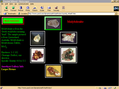
I wanted to create a page for my Dynamic Earth Web site that showed several different minerals and included a moveable “frame” that positioned itself over each image based on some event. When the frame was over the image, the image was activated — if the user clicked on it, information about the mineral would appear. Of course I knew I could use CSS1 to create a frame around content, then use CSS-P to move the frame, but I wanted the interior of the frame to be transparent.

The solution I came up with was to create the frame using a one-pixel transparent GIF for the interior, setting its width and height to be the exact size of the frame I wanted. Using CSS-P, I could then move this GIF around from image to image. I also created two separate layers for each image: one that had the original image, which didn’t do anything when the reader clicked it, and another that had a framed, transparent GIF, which showed the mineral information layer when clicked. Figure 1 shows a snapshot of this page:


Figure 1

The one-pixel transparent GIF turned out to be much more than a simple placement and whitespace tool; it’s a handy tool that can be stretched and shrunk as needed and reused as often as necessary.

Positioning a menu for both old browsers and new
I soon found other uses for my newly rediscovered little GIF file, including a solution for a new Web page authoring problem I encountered.

I used to have a menu along the top of my pages that contained four separate images and text-based links just below the images. I used an HTML table to control the placement of images and text, ensuring that the images were placed directly next to each other and were aligned along the top of the page. One thing I never liked about this approach was that I preferred that menu text be layered over the images rather than displayed below them.

With CSS-P, I could position the images at the top of the page and use absolute positioning to place the menu text over the images. The problem I encountered, though, is that the page didn’t look very good when viewed with a pre-Navigator or IE 4.0 browser.

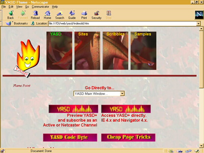
Instead, I used an HTML table along the top of the page, including the four images and their associated text in the table cells. However, I included these images and text in blocks delimited by <DIV> tags (these allow formatting to span multiple elements) and then used CSS-P to position the images and text so they overlapped. With this approach, older browsers see the page as they always have, as shown in Figure 2, but in the newer browsers the page has the new overlapped look, as shown in Figure 3.


Image Missing
Figure 2


Figure 3

There was one last problem with this approach, though. The thing with absolute positioning is that if you have it on content within a table element, the contents do not influence the table row’s height or the table cell’s width. This means that any other content on the page gets placed after the table, but overlaps the images and text because the table is not sized correctly.

I found that a simple solution for this was to use my trusty one-pixel transparent GIF as the first table cell and set it to the height I wanted the table to occupy. This sized the entire row to the height I needed to cover the positioned content — once again, a successful blend of the old and new.

Categories
Specs

Getting started with cascading style sheets

Originally appeared in Netscape World, now archived at Wayback Machine

Web page authors want to control more than what basic HTML provides, yet they also want their pages to display in the same manner across multiple browsers and multiple platforms. HTML provides the tools that allow us to create hypertext links, frames, tables, lists, or forms, but it does not provide fine control over how each object is displayed.

As an example, to create a hypertext link in a page, the Web page author would use the following syntax:

<A HREF="http://www.somecompany.com/index.html"> link page </A>

Interpreted by Netscape’s Navigator and Microsoft’s IE (Internet Explorer), the link would display on the Web page in whatever manner is determined by the browser.

To address this problem, Navigator and IE both support an extension to the <BODY> HTML tag that lets a Web page author change the color of unvisited, visited, and active links, as shown in the following statement:

<BODY link=#ff0000 alink-#00ff00 vlink=#0000ff>

This statement would display unvisited links in red font, visited links in green font, and active links (clicking on a link makes it active) as blue, unless the user overrides this in their browser. Many Web pages now define the color of the links for a page using this technique. However, the technique of providing specific display attributes for a tag becomes less workable when we consider tags such as the paragraph tag, which can be used many times in one page.

Following in the trend set by the <BODY> link attribute, we would need to create display attributes for the paragraph (<P>) tag and then apply these attributes whenever we wish to display text in some manner other than the default. This again, is workable, though the concept starts to become much more involved.

Where the idea breaks down is if the page author wants to change the color attribute of the paragraph, and then has to search through every web page to make look for where the attribute has been applied, and then make this modification. Additionally, if a company would like to provide a standard formatting of all paragraph tags for all web site pages, each web page creator would need to be aware of what the standard was, and remember to consistently apply it. A better solution would be to change the attribute once per page, or even once in a separate document and have it work on many pages.

Another option to apply formatting would be for the Browser creators to create new HTML extensions to be used for presentation, such as Netscape did with the <FONT> element (see “What’s wrong with FONT). This idea breaks down when one considers that other browsers viewing any material formatted by the new tag will not be able to see the material, or will see it in a manner that may make it illegible.

What is needed is a general formatting tag that one can use to create format definitions, which can be applied to one or more HTML elements. This technique of using one tag to cover extensions was used with the scripting (<SCRIPT>) tag and has worked fairly well.

Enter the concept of style sheets. Style sheets are methods to define display characteristics that can then be applied to all or some instances of an element, or multiple elements. Specifically, the W3C has recommended the adoption of CSS1 (Cascading Style Sheets).

What is CSS1Style sheets provide formatting definitions that can be applied to one or more HTML elements. An example of a style sheet would be the following, which sets all occurrences of the <H1> header tag to blue font:

H1 { color: blue }

CSS1 extends this by defining style sheets that can be merged with the preferences set by both the browser and the user of the browser, or other style settings that occur in the page. The style effect cascades between the different definitions, with the last definition of a style overriding a previous definition for an element.

As an example, the following will redefine the header tag <H1> to be blue, with a font of type “Arial”, size 24 point, and bold:

H1 { color: blue; font-family: Arial ; font-size: 24pt }

With this specification, any time the <H1> tag is used in a page, the text will be displayed in Arial, 24pt, blue font. We define a second style for the <STRONG> tag using an inline definition that will override the first:

<H1 STYLE="color: red">

The difference between this and the first definition is that the latter redefines the formatting for the <H1> tag, but only for that specific use of the tag. This will not impact on any other uses of the H1 tag in the document. If the style definition in the HEAD section had attached a weight to the style, using the important keyword, the original specification would have taken precendence over the second one:

H1 { color: blue ! important; 
         font-family: Arial ; font-size: 24pt }

Styles can be nested, as follows:

H1 EM { color: red }

Now, if the EM tag is used within a H1 header, the EM specification will apply to the text in addition to any other style specification given for the H1 tag. This type of style property is referred to in the CSS1 style guide as a contextual selector. Each element referenced in the line is analogous to an element within a pattern list, and the browser applys the style to the last element in the list that successfully matches the pattern it is processing

W3C has recommended two levels of compliance for CSS1: core and extended. The standard can be seen at this W3C Web page).

At this time, only IE has partially implemented CSS1 in version 3. However, both Netscape and Microsoft have committed to implementing at least the core specification of CSS1 in version 4.0 of their browsers.

The rest of this article will give examples of using CSS1 that will display using IE 3.x. Unix users can download a testbed client, named Amaya, that will allow them to see the results of the style sheets. Amaya was created by the W3C and can be downloaded from at this W3C Web page.

How CSS1 worksAs shown in the previous section, formatting information can be defined for an existing element and this formatting will apply to all uses of the element unless it is overridden or modified by other definitions.

The definition, delimited by new HTML tags of <STYLE> and </STYLE> can be inserted into the <HEAD> section of the page, into a separate document, or inserted in-line into the element itself.

As an example of embedding style information into the header of a document, the next bit of code will create a style sheet that will modify how paragraphs display in a page:

<STYLE type="text/css">
	P { margin-left: 0.5in; margin-right: 0.5in; margin-top: 0.1in; color: red }
</STYLE>

Now, with this definition, any paragraph on the page will have a margin of half and inch for both the left and right margins, a margin of one-tenth of an inch for the top, and will have a red background. No other formatting is necessary to apply this style to every use of the paragraph tag in the entire document.

Another method will allow the Web page author to define style sheets in a separate document that is then imported into or linked to a Web page. To import a Web page, the import keyword is used, as shown in the following syntax:

<STYLE type="text/css">
	@import url (http://someloc);
</STYLE>

The imported style sheet will merge with any styles defined directly in the existing page, or by the browser/user, and the resultant combined styles will influence page presentation. Note that IE 3.x does not support the import keyword, though this should be implemented in version 4.0.

The second method of including a style sheet file is using the LINK tag:

<LINK REL=STYLESHEET HREF="standard.css"
TYPE="text/css">

Using this type of tag will insert a style sheet into the existing Web page that overrides any other style definition for the page, unless style sheets have been turned off for the page. It is an especially effective approach to use when a company may require that all Web pages follow specific formatting.

Let’s see CSS workGranted, if you go a little crazy using CSS1, your page is going to end up looking like something that will land you in a Federal prison if you sent it through the US Mail. An example of this can be seen in a page I call “expressionism with an attitude.”

Impartial observers would call it “the ugliest page they’ve ever seen on the Web.” However, with a little restraint (and of course, we all use restraint in our Web pages), CSS1 can turn a bland page into a grabber.

I have a Web page on my Scenarios site that uses a combination of display properties as defined by Netscape, style sheets as defined by Microsoft, and HTML tables.

Stripping away all but the most basic HTML tags leaves a page that has a lot of content, but without formatting is cold and not very interesting.

Unless the viewer was highly motivated to view the contents, chances are they would skip the page.

The first change to make is to add both a background image and background color to brighten the document up a bit. The full implementation of CSS1 allows the Web page author to specify whether a background image should repeat, and if it does, whether it will repeat horizontally or vertically. This is welcome news for those who have created really long, thin graphics to be able to give that attractive sidebar look to a page. Unfortunately, IE 3.0 does not implement this attribute, nor is it implemented with Preview Release 2 of Netscape Navigator. Instead, the image used in the example is one that can repeat gracefully. The style sheet is:

<STYLE TYPE="text/css">
	BODY { background-image: URL(snow.jpg) ; 
		background-color: silver }
</STYLE>

With the image, the style sheet also adds a default color in case the person accessing the page has turned off image downloading.

Adding the background image is a start, but the text is still a bit overwhelming and rather dull looking (but not reading, of course).

It would be nice to add a margin to the document, as well as changing the overall font to Times 12pt. In addition, modifying the formatting for both the <H1> header and the <STRONG> tags would help add a bit of color and contrast to the document:

<STYLE TYPE="text/css">
	BODY { background-image: URL(snow.jpg) ; 
		background-color: silver ; 
		font-size: 12pt ; font-family: Times;
		margin-left: 0.5in ; margin-right: 0.5in ;
		margin-top: 0in }
	H1 { font: 25pt/28pt blue ; color: navy ; 
		margin-top: -.05in ; margin-left: 1.0in } 
	STRONG { font: 20pt/22pt bold; color: maroon ; 
		font-family: Helvetica ; font-style: italic}
</STYLE>

At the time this was written, Netscape Navigator Preview release 2, in Windows 95, only implemented size units of em and ex. The first unit definition is the height defined for the font, the second is the height defined for the letter ‘X’ in the font. The results are an improvement, but you still can’t easily spot two sidebars that are inserted into the document.

To correct this, a generic class is created and named “sides”, which will contain a formatting definition that can be applied to any element. This is done by naming an element prefixed with a period (‘.’) to represent the class:

.sides { background-color: white ; margin-left: 0.5in; 
	margin-right: 1.0in ;
	text-align: left ; font-family: "Courier New" ; 
	font-size: 10pt }

Looking at the page now, the sidebars stand out from the rest of the document.

The class is used with the <DIV> tag, which allows the formatting to span multiple elements until an ending </DIV> tag is reached:

<DIV CLASS=sides>
</DIV>

The class could also have been used in each individual paragraph tag that makes up the sidebar:

<P CLASS=sides>

Additionally, instead of a class, we could have created an ID attribute for the style:

#sides { background: white ; margin-left: 0.5in; 
	margin-right: 1.0in ;
	text-align: left ; font-family: "Courier New" ; 
	font-size: 10pt }

Using the identifier would be:

<DIV ID=sides>
</DIV>

W3C wants to discourage use of the ID attribute. The W3C wants people to provide classes for an existing HTML element that only applies to that element. Then if people which to cascade the effect they use the parent-child style specification as stated earlier with the <H1> header and <STRONG> tags.

Notice from the example, and only if you are using IE 3.01, that the background color for the class is only applied to the contents and not to the area represented by a rectangle that would enclose the contents. As this looks a bit odd in the example, it is removed from the definition.

In addition to removing the background color from the “sides” class, the next change to the document will add another definition for the STRONG tag to be used in the sidebars and formatting definitions for the hypertext links.

A hypertext link is referred to in the CSS1 standard as a pseudo-class because browsers will usually implement a different look for a visted link than one that has not been visited. This type of element can take a class style specification, but the browser is not required to implement the specification.

Another change will be a specific class definition of “sides” that differs from the original class definition and which will be used for specific paragraph tags:

.sides { margin-left: 0.5in; 
	margin-right: 1.0in ;
	text-align: left ; font-family: "Courier New" ; 
	font-size: 10pt }
 
STRONG { font-size: 22pt; color: maroon ; 
	font-family: Helvetica ; font-weight: bold}
STRONG.extended { font: 18/20pt bold; color: red ; 
		background-color : silver; font-style: italic }
 
P.sides { margin: 0.25in 0in 0in }
A:link { color : red }
A:visited { color : teal }

Using the <STRONG> tag with the extended style would look like:

<STRONG class=extended>

To use the original formatting, no class name is given.

The page is definitely improving.

The sidebars stand out and spacing has improved the ease with which the page can be read. Unvisited links stand out with the bright use of color, yet blend in to be non-obtrusive after the link has been visited.

A final change is made, which is to add formatting to the lists contained in the page. The Web page has both an ordered list, where the elements are numbers, and an unordered list, where the elements are bulleted. Styles are added to each of these list types to display them more effectively. Formatting is added to the generic paragraph tag to indent the start of every paragraph:

OL { margin: 0in 0.5in 0in; font-size: 10pt }
UL { margin: 0in 0.2in 0in }
 
P { text-indent: 0.2in }

The lists now have new formatting, and all paragraphs are indented. With the cascading nature of CSS1, the paragraphs that are defined with the “sides” style inherit the indentation from the parent style, which is denoted by the use of the ‘P’ classifier without any specific class or identifier selector.

The displayed Web page also makes use of several in-line styles definitions, strategically placed to override some of the generic formatting options. There are a few paragraphs that should not be indented in the first line. Overriding the original paragraph specification is an in-line one that sets the indent to ‘0’:

<P STYLE="text-indent: 0in">

This turns off the text indentation.

The paragraphs that label the two figures that are included in the document are defined to increase the left margin another half-inch. As styles inherit from the parent element in which they are embedded, the figure paragraphs will have a left margin set to one inch rather than a half as the new style is merged with the one specified for the entire document:

<P STYLE="margin-left: 0.5in; color: green; font-weight: bold">

The font for the figure paragraphs is also changed to be green and bold.

The paragraphs at the end of the document that contain the trademark and copyright information are also modified with an in-line style:

<P STYLE="text-indent: 0in ; font-size: 8pt; font-style: italic">

This style sets the font to be smaller, and italic.

Positioning the elementsOne improvement that would have helped the page is being able to position the sidebars to the side of the document and have the rest of the document “flow” around them, as happens with print magazines. Another would be to be able to specify a background color for the sidebars that would have “filled” the rectangle enclosing the contents, not just the contents themselves.

CSS1 defines formatting of elements but does not define positioning of them. To this end Netscape and Microsoft have collaborated (yes, you read that right) on a proposed modification to the CSS1 that would provide a standard specification for how elements can be positioned on the page.

The W3C proposal, “Positioning HTML elements with Cascading Style Sheets”, provides the ability to define areas for the content to flow into. These areas can then be positioned relative to each other, using “relative positioning” or in absolution position to each other using, what else, “absolute positioning.”

From the recommendation, an example of absolute positioning could be:

#outposition {position:absolute; top: 100px; left: 100px }

Using this style sheet in the document as follows:

<P> some contents
<span id=outposition> some contents defined for a different position</span>
</P>

This code will result in the contents enclosed in the SPAN tag to be positioned in an absolute space beginning at the position defined as 100 pixels from the left and 100 pixels from the top. The enclosing rectangle will extend until it hits the right margin of the parent element, in this case the document. The height will be long enough to enclose all the contents. However, both the width and height of the elements could also have been defined.

Relative positioning allows elements to be positioned relative to each other, even if this means the elements overlap:

#newpos {position: relative; top: -12px }

The contents formatted by this style sheet will position themselves above the rest of the contents, moving the other contents down.

In addition to positioning along the X- and Y-axis (horizontally and vertically on the web page), the elements can also be positioned to each other on the Z-axis. This means that web developers will be able to layer elements on top of each other. An example pulled directly from the positioning paper is:

<STYLE type="text/css">
<!--
.pile { position: absolute; left: 2in; top: 2in; width: 3in; height: 3in; }
-->
 
<IMG SRC="butterfly.gif" CLASS="pile" ID="image" STYLE="z-index: 1">
 
<DIV CLASS="pile" ID="text1" STYLE="z-index: 3">
This text will overlay the butterfly image.
</DIV>
 
<DIV CLASS="pile" ID="text2" STYLE="z-index: 2">
This text will underlay text1, but overlay the butterfly image
</DIV>

With this, the order of the elements would be the image on the bottom then the contents defined by the class “text2”, and finally the contents defined by the style “text1”. The elements are transparent meaning that the bottom elements will show through to the top, though this can also be changed using style sheet settings.

Another recommendation is the ability to define whether an element is visible or not, which would still maintain its position in the document, and whether the element is even displayed which would remove it from the display, including the space reserved from the element.

The ability to position HTML elements, to control their visibility, and to finally control how they overlap is a revolutionary change to HTML document design.

What’s next?With Microsoft and Netscape both committed to the support of CSS1, and both participating in an extension to the CSS1 proposal to provide for positioning of HTML elements, creating HTML pages that display effectively in both browsers should be a snap. However, there is one element that was not discussed in this article and which can tear down the browser truce flag: dynamic movement of HTML elements.

As can be seen with the release of Navigator 4.0, Netscape supports script based movement of elements with their LAYER tag and with a style sheet concept they call Javascript Style Sheets (JSS). With the release of Internet Explorer Preview in March, Microsoft supports dynamic content through their own version of Dynamic HTML, which uses CSS1 elements directly. Unfortunately, neither method will work with the other browser.

As with the problems that have been faced with JavaScript, mentioned in the Digital Cats’ article “Whose JavaScript is it, anyway?” until Microsoft and Netscape agree on a standard scripting Object Model, you and I will continue to have to work around browser differences if we want dynamic content. Or use Java applets, and forgo all uses of scripting.