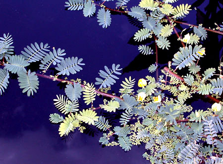
Yesterday I took several photos during an afternoon’s hot, humid shooting at the Botanical Gardens. The dragonflies were thick as ticks, and by the time I was done, my face was red, my shirt soaking wet.
When I uploaded the photos, into a post called Shape and Color, I tested the page in Preview using Fire & Ice stylesheet. The photos looked awful with the coloring and the photos on the side. I tried them with Route 66, and Burningbird of Happiness, but none of the stylesheets looked good. Even Random Shot, though relatively neutral in coloring, was too ‘busy’, with the photos on the side and in the post.
When I tried Lemon Shake-Ups, ahhh! Quick, close it! My eyes are bleeding!
None of my stylesheets is really set up for photos, especially when my photos can range from pink pastel to vivid orange and lime green. In addition, photos in the posts wreck havoc with that micreant browser, Internet Explorer.
I had planned on creating the Tin Foil Project for photo projects, and as my test weblog for upgrading from WordPress 1.2 to 1.3. However, in order to display some of the later summer floral shoots, I’ve decided to move up the time line. Check out the site.
I experimented with colors for the background, including the traditional black, white, and gray used for many photo albums. However, I felt that the black washed out the colors, and white was too bright–both created too much contrast at times. I also thought the grays reduced the brightness of the colors, or at least this is what I perceived from my inexpert viewpoint.
(ed. Or maybe what it all reduces to, is I wanted to try something new.)
I then remembered something my a karate teacher I had years ago in Arizona told me. He was a master carpenter, actually getting a MFA based on his furniture making. His thesis work was this incredible cabinet created for his dojo that featured inlay woods and hand smithed silver work – an amazing piece of craftsmanship.
Anyway, I noticed that one of the pieces he made for his home had a painted background behind the shelves rather than being finished wood. It was a pale gray/green color, relatively neutral in tone. I asked him about this at the time and he said that many cabinet makers will use a green backdrop because it complements most colors, without dimming them, contrasting too heavily, or causing the colors to seem to shift.
Considering that nature herself uses green as a backdrop for many of her brighter works, what he said made a lot of sense. So I spent today experimenting around with green colors, until reached what you see. Hopefully the photos are enhanced by the color, and the background images, which are transparent black & white merged into backgrounds the same color as the web page.
One issue I’m still dealing with is a slight margin of color around the images creating a faint line in the page. However, I think I can manage to eliminate it with PhotoShop.
The only time I’ll use photos at Burningbird, now, will be smaller ones complementary to a story. Any writing featuring larger numbers of photos, or photo posts only will be posted at Tin Foil. This means much of my photographical and sensory work will shift to that weblog.
(Eventually I’ll have functions that will list recent writing across all the weblogs (Practical RDF, Tin Foil Project, and Burningbird) ; comments, too, if I can manage it.)
If you have a moment, let me know what you think.

